A Nostalgic Look Back at
Apostrophe Atrophy's Examples
Apostrophe Atrophy was a photographic collection of bad typography. This was their website.
Content is from the site's 2008 archived pages, as well as from other outside sources. Bob Sakayama & TNG/Earthling provided technical and search support. Thanks to Dov Hertz for his support.
The apostrophe has three uses: 1) to form possessive nouns; 2) to show the omission of letters; and 3) to indicate plurals of letters, numbers, and symbols.
The apostrophe (' or ') character is a punctuation mark, and sometimes a diacritical mark, in languages that use the Latin alphabet and some other alphabets. In English it is used for several purposes: The marking of the omission of one or more letters (as in the contraction of do not to don't).
Apostrophes are used to indicate possession for nouns (not pronouns i.e. its, their, whose, and your). They're also friends to the contraction (i.e. it's, they're, who's, and you're).
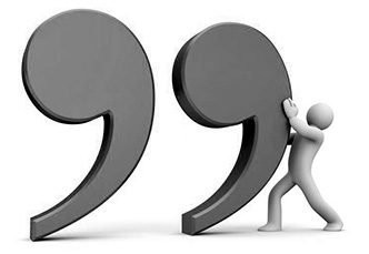
Apostrophe Atrophy
MARCH 17, 2008 BY CHRIS HIGGINS | www.mentalfloss.com/

I'm a sucker for any hyper-specific blog about typography, grammar, even handwriting. Anything to do with words or word-nerd stuff, really. Witness: my recent post on The Lowercase L, my longtime devotion to "misused" quotation marks, and some awesomely smart signs. Today allow me expand your nerdy typographic horizons with Apostrophe Atrophy, a blog about the misuse of "dumb apostrophes" and "dumb quotes."
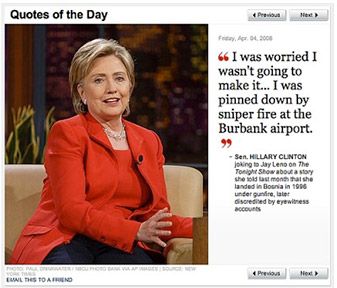
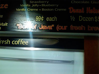
What's dumb about an apostrophe or a quote? Well, Apostrophe Atrophy is referring to those "straight quotes" that don't show the direction of the apostrophe or quote in question. In many word processing and design applications you have to turn on "smart quotes," and it looks like many people just don't go there. Apostrophe Atrophy collects examples of poorly-used dumb apostrophes in the wild, but also finds some amazing mixtures of the smart and dumb, for example:
Update: by popular request, let me explain what's wrong with the image above. Note how the quotes around "Wire" and "Evacuate" are curved (aka, smart), but the one within "Simon's" is straight (dumb). See, I said it was hyper-specific.
I think I enjoy this type of blogging so much because there are many layers to each image: 1) A design/typographical mistake; 2) Technological issues (in this case, computers versus quotes); and 3) The actual content of the image in question, which is often pretty interesting: in the case above, the actual article is great stuff, despite the mix of smart and dumb quotes in its headline. This type of multi-faceted thinking definitely activates the Nerd Center in my brain. How about you?
When NOT to Use an Apostrophe
https://grammar.yourdictionary.com/

The apostrophe likes to walk on the wild side. They're these teeny, tiny punctuation marks that are majorly misused every single day. Apostrophes are used to indicate possession for nouns, but not pronouns (i.e. its, whose, and your). They're also friends to the contraction (i.e. it's, they're, who's, and you're).
Possession and contraction. Sounds pretty straightforward, right? Well, don't be fooled by this little guy; the apostrophe trips up millions of people all day, every day. It gets inserted into words it shouldn't be in or omitted from words it should be in all the time. We're going to show you when NOT to use an apostrophe, and make sure you don't join the ranks of English-language speakers who often confuse its (not it's) primary purpose.
Contraction Catastrophes
Contractions were created to make things easier. They tighten up two words into one, offering an evasion from redundancy and over-usage. In the end, that didn't go so well, as contractions are regularly misprinted in writing all across the globe. Let's take a look:
It's vs. Its
In the land of texting, where we shorten "you" to "u", it's no surprise that we often skip the apostrophe, turning it's to its. Of course, it's should be used as a contraction of it is, while its is only used to show possession.
- It's (it is) your responsibility to be a grammar queen.
Any time you have an it's or an its in your writing, double-check the sentence. If you can say "it is" in its place, then you DO need the apostrophe. If its is showing something has possession or ownership of something, then you do NOT need an apostrophe and using its is correct.
- The dog was chewing on its bone. (Possessive because the bone is in the possession of the dog.)
Who's vs. Whose
Here's another misunderstood contraction. Here, we have who's, contraction of who is, and whose, a personal pronoun.
- Who's (who is) going to love me if I can't get my apostrophes right?
- Whose apostrophe is this?
If you can use "who is" instead of who's in the sentence the apostrophe stays. If there's an E on the end of "whose" do NOT use an apostrophe.
Your vs. You're
Just in case we didn't drive the contraction thing home yet, let's look at one more common error that makes every editor, professor, and book aficionado cringe.
- Your apostrophe usage is spectacular.
- You're (you are) not demonstrating a spectacular handle on comma usage.
Similar to the its vs. it's premise, just double-check your sentences. If you can say "you are" in its place, then keep the apostrophe hanging. If it is showing possession (your dog, your usage), you do NOT want to use an apostrophe.
There vs. Their vs. They're
Remembering that apostrophes mainly like to hang out with contractions, there's only one time an apostrophe enters into the there, their, they're family of homophones.
- There is an apostrophe in the contraction "they're."
- They're (they are) not playing well with apostrophes.
- Their apostrophe usage is not their strongest point.
If you're talking about something in a certain place (there) or something that belongs to people (their) you do NOT need to use an apostrophe.
On a Date
1930s vs. 1930's vs. '30s
Everyone loves a hot debate, right? Well, this is the hottest one in town! Do you put an apostrophe after dates like those above? Well, there's really no need for such heated conversation, as you only have to ask yourself three quick questions. Is it a contraction? Is it indicating something missing? Is it showing possession? Let's take a look:
- You could say that 1930's music and dance scene set the stage for many great composers. (Possession)
- The '30s were great years for jazz and swing music. (Omission)
- The 1930s were a great time for music and dance. (Plural)
In this case, the only time you would NOT use an apostrophe is when the date is plural.
Let's Get Plural
Store signs have been notorious over the years for grammar errors. What's wrong with these signs?
Bob's Cheesesteak's and Cubano's
Smith's Greengrocer's: The Best in Town
Often, apostrophes mistakenly find their way into plurals. Remember, if it's a contraction or a possession, only then are apostrophes on the guest list. So, the signs above should read:
Bob's Cheesesteaks and Cubanos
Smith's Greengrocers: The Best in Town
If, however, a plural noun needs to show possession, then it's time for the apostrophe to come on over. An apostrophe showing the possessive on a plural needs to go after the S that is making the word plural. So it would be acceptable to say:
Bob's secret is in his cheesesteaks' sauce.
Or, it could reference a singular cheesesteak and say:
Bob's secret is in his cheesesteak's sauce.
The point is: no possession, no apostrophe.
Possess Apostrophe Power
Apostrophes are finicky little things that only like to express their jubilation when the timing is right. So, only two occasions will give them cause to hop out into the limelight: contractions and noun possessions. If we can all remember that, then we're one step closer to becoming apostrophe aficionados, and who wouldn't like a title like that?
EXAMPLES
Brought to you you by
The Studio of M.E.A.T.
May 2

Via La Dumb Apostrophe Revolution!
Found on Stencil Revolution via kunstbetrieb.org via swissmiss.
April 30

From the book “Pentagram Marks”
We suspect that Michael Gericke of Pentagram made it.
April 30

Wrong. Right. Wrong. Right. That’s what they call “consistent brand image”.
April 30

I guess after two days of drinking those quotes won’t matter anymore.
April 30
Just vote Obama.
April 30
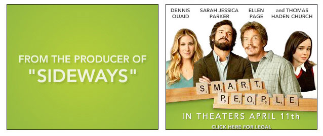
Smart People; Dumb Quotes.
April 30
That is not how it should be.
April 30

Giant metal sign again. Apparently they don’t make apostrophes in metal.
April 30

At least they kerned the periods.
April 30

You know, the famous one.
April 30

Express apostrophes as well, apparently.
April 30

The apostrophes could have used some “Luck of the Irish”.
April 30

Insert punch line here.
April 30

One store, two signs, zero correct apostrophes.
April 30

Sassy indeed.
March 1

Dumb Quotes. So much for Obama’s superior use of typography.
February 20

I love their pig.
Hate their typography.

The wrong kind of apostrophe is bad enough… But to also use Copperplate.
Gross.
February 20

Did they really have to spotlight it like that?
February 20
Not exactly wrong, but definitely not right. Found on the board at the Donut Pub.
February 9

Ditto.
February 9

a graphic design studio, we also provide very wrong apostrophes.
February 9

Definitely not an apostrophe.
February 9

Four of a kind!
February 9

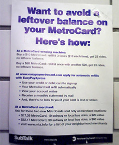
Use that 50% to buy some real apostrophes.
More Background On ApostropheAtrophy.com
ApostropheAtrophy.com stands as a distinctive and highly focused website dedicated to documenting the misuse of apostrophes and quotation marks in everyday environments. At first glance, the subject may appear trivial—after all, it revolves around a single punctuation mark—but the site reveals how something so small can reflect broader issues in language, design, education, and technology.
ApostropheAtrophy.com is best understood as both a visual archive and a commentary platform. Through curated images of real-world signage, advertisements, and printed materials, it highlights how frequently apostrophes are misused. In doing so, it taps into a long-standing fascination among writers, editors, designers, and linguists: the tension between formal grammatical rules and their inconsistent application in modern communication.
Historical Context and Founding
The site emerged during the mid-to-late 2000s, a period when blogging culture was thriving and niche content communities were rapidly expanding. ApostropheAtrophy.com fit squarely into this ecosystem, joining a wave of “micro-topic” blogs that explored highly specific interests—from typography and kerning to punctuation and grammar.
The site’s archived pages from around 2008 suggest that it was actively maintained during this period, when digital photography and blogging platforms made it easier than ever to capture and share real-world examples of design and language errors. Contributors and supporters—including individuals like Bob Sakayama and collaborators providing technical and search support—helped sustain the site’s visibility and accessibility over time.
The project’s concept was simple but effective: collect and display photographic evidence of incorrect apostrophe usage. However, its execution elevated it beyond a mere gallery. Each example often invited viewers to analyze not just the grammatical mistake, but also the design choices, production processes, and contextual meaning behind the image.
Purpose and Goals
At its core, ApostropheAtrophy.com aimed to do three things:
- Document common typographical errors
The site functioned as an archive of mistakes found in public spaces—storefront signs, menus, promotional materials, and more. These examples illustrated how pervasive incorrect apostrophe usage is, even in professionally produced materials. - Educate through humor and observation
Rather than presenting itself as a strict grammar authority, the site adopted a tone that blended critique with humor. Visitors were encouraged to learn by observing mistakes, often accompanied by witty commentary. - Highlight the intersection of language and design
Apostrophe errors were not treated purely as grammatical issues. The site frequently pointed to underlying causes such as font limitations, design software defaults, or production shortcuts—making it especially relevant to graphic designers and typographers.
Content Structure and Features
The primary content of ApostropheAtrophy.com consisted of dated posts, each showcasing one or more examples of incorrect punctuation. These posts were typically brief, image-driven entries with concise commentary.
Photographic Examples
The backbone of the site was its collection of photographs. These images captured real-world instances of apostrophe misuse, such as:
- Apostrophes incorrectly used to form plurals (e.g., “apple’s for sale”)
- Missing apostrophes in contractions (e.g., “dont” instead of “don’t”)
- Misuse of quotation marks, particularly “dumb” (straight) quotes versus “smart” (curved) quotes
- Inconsistent punctuation within the same design or brand
These examples ranged from small, handmade signs to professionally printed materials, demonstrating that errors occur across all levels of production.
Commentary and Tone
The accompanying text for each post was often short, sharp, and humorous. Rather than lengthy explanations, the site relied on the visual impact of the error and a quick observation to make its point.
For example, a post might simply note the irony of a sign attempting to appear professional while containing glaring punctuation mistakes. This minimalist approach allowed visitors to engage directly with the content and draw their own conclusions.
Thematic Consistency
Despite the wide variety of images, the site maintained a strong thematic focus. Every post tied back to the central idea of “apostrophe atrophy”—the gradual erosion of correct punctuation usage in public communication.
The Role of “Smart” vs. “Dumb” Quotes
One of the more nuanced aspects of ApostropheAtrophy.com was its attention to the distinction between “smart” and “dumb” quotes. This reflects a deeper understanding of typography that goes beyond basic grammar.
- Smart quotes are curved and directionally correct, used in professional typesetting.
- Dumb quotes are straight marks, often the default in basic text input systems.
The site frequently highlighted cases where designers mixed these styles incorrectly, creating visual inconsistency. This issue often arose from software settings—many programs require users to enable “smart quotes” manually.
By focusing on this detail, ApostropheAtrophy.com expanded its relevance from grammar enthusiasts to design professionals, emphasizing that typography is both a technical and aesthetic discipline.
Ownership and Contributors
While ApostropheAtrophy.com was not a large corporate project, it benefited from contributions and support from individuals involved in design, writing, and technical fields. Figures such as Bob Sakayama played a role in providing technical and search-related support, helping ensure that the site remained accessible and discoverable.
The decentralized nature of its contributors reflects the broader blog culture of the time, where passionate individuals collaborated informally to build and maintain niche platforms.
Popularity and Audience
ApostropheAtrophy.com appealed to a specific but dedicated audience:
- Graphic designers and typographers
- Writers, editors, and grammar enthusiasts
- Educators and students of language
- General readers with an appreciation for humor and detail
Its popularity was bolstered by mentions in other publications and blogs, including coverage by outlets like Mental Floss. Such features helped introduce the site to a wider audience, particularly those interested in quirky or intellectually engaging content.
The site’s appeal lies in its ability to resonate on multiple levels. For some, it is a source of humor; for others, it is a reminder of the importance of precision in communication.
Cultural and Social Significance
ApostropheAtrophy.com occupies an interesting place in the cultural landscape of the internet. It reflects a broader phenomenon: the rise of “grammar vigilance” and the public discussion of language standards.
The Internet and Language Evolution
The early 2000s saw rapid changes in how people communicated, driven by email, texting, and social media. These shifts often led to more informal language use and, in some cases, a decline in adherence to traditional grammatical rules.
ApostropheAtrophy.com can be seen as a response to this trend. By documenting errors, it implicitly advocates for maintaining standards while acknowledging the realities of modern communication.
Humor as a Tool for Education
The site’s tone is crucial to its impact. Rather than criticizing individuals harshly, it uses humor to highlight mistakes. This approach makes the content accessible and engaging, encouraging learning without alienation.
Design Awareness
For designers, the site serves as a reminder that typography is not just about aesthetics—it also conveys meaning and credibility. A misplaced apostrophe can undermine the professionalism of a brand or message.
Examples and Insights
The site’s examples often reveal deeper insights into why errors occur:
- Technological limitations: Older design tools or default settings may not support proper punctuation.
- Lack of proofreading: Many errors appear in professionally produced materials, suggesting insufficient quality control.
- Misunderstanding of rules: Common mistakes, such as using apostrophes for plurals, indicate widespread confusion about basic grammar.
These insights make ApostropheAtrophy.com more than just a collection of errors—it becomes a diagnostic tool for understanding broader patterns in communication.
Relationship to Other Typography and Grammar Projects
ApostropheAtrophy.com is part of a larger ecosystem of websites and blogs dedicated to language and design. Similar projects focus on:
- Misused quotation marks
- Poor kerning and spacing
- Awkward translations or “Engrish”
- Signage errors in public spaces
Together, these sites form a kind of informal archive of linguistic and typographic quirks, documenting how language is used—and misused—in the real world.
Longevity and Archival Value
Although ApostropheAtrophy.com is primarily known through its archived content, its value has not diminished over time. In fact, it has gained a certain nostalgic appeal, representing an era of internet culture characterized by independent, passion-driven projects.
Archival tools like the Internet Archive have played a crucial role in preserving the site’s content. This ensures that future audiences can continue to explore and learn from its collection.
Educational Applications
The site has practical applications in education:
- Teaching grammar: Real-world examples make abstract rules more concrete.
- Design training: Students can learn about typography and consistency.
- Critical thinking: Analyzing errors encourages attention to detail.
Educators can use the site as a resource to engage students in discussions about language and communication.
Criticism and Limitations
While ApostropheAtrophy.com is widely appreciated, it is not without limitations:
- Narrow focus: Its specialization may limit its appeal to a broader audience.
- Lack of depth in explanations: The brief commentary may not fully explain the rules behind each error.
- Potential for elitism: Some critics argue that grammar-focused content can come across as overly pedantic.
However, these limitations are largely inherent to its format and purpose. The site was never intended to be a comprehensive grammar guide but rather a curated collection of observations.
Legacy and Continued Relevance
ApostropheAtrophy.com remains relevant because the issues it highlights have not disappeared. If anything, the rise of digital communication has made punctuation errors even more common.
Modern platforms—social media, messaging apps, and user-generated content—continue to produce examples that would fit seamlessly into the site’s archive. This ongoing relevance underscores the enduring importance of its core message: attention to detail matters.
~~~
ApostropheAtrophy.com is a compelling example of how a narrowly focused idea can yield broad insights. By documenting the misuse of apostrophes and quotation marks, it sheds light on the complexities of language, the challenges of design, and the quirks of human communication.
Its blend of humor, observation, and visual storytelling makes it both entertaining and educational. Whether viewed as a nostalgic artifact of early internet culture or as a timeless commentary on language, ApostropheAtrophy.com continues to resonate with anyone who cares about how words are written and presented.